
THE OLD SCHOOL PRESS
Moments in the making of The Colours of Rome.
Click on the image to move on to the next.
Setting the standard
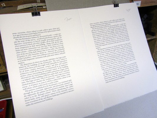
The final task is to determine the amount of ink that I want to lay down. There
is of course a relationship between the weight of impression and the darkness of
the resulting print: the harder you impress, the more ink is left on (and in)
the paper, but I would like to get the amount of impression and then adjust the
inking, remembering always that ‘less ink, more impression’ is better than ‘more
ink, less impression’ – we want to see the shape of the letters. Elsewhere I
have described how on a proof press one needs a strategy for ensuring that
all the sheets in a copy have the same density of ink throughout. It does not matter if one copy is overall
darker or lighter than another: the crucial thing is that within a single copy
there should be consistency of colour. (How often do we open a modern paperback and find, on facing pages,
text that is barely legible for
lack of ink and text that is smudgy with too much ink?)
Copyright © Martyn Ould 2013.