 |
THE OLD SCHOOL PRESSMoments in the making of Palladio's Homes Click on the image to move on to the next. |
|
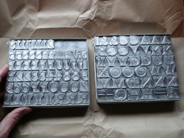
More type needed I decided to use Castellar (designed for Monotype in 1957 by John Peters) as the display face for the book. It is a beautiful face, one that I used for the title of The Bricks of Venice, and I think it goes well with Dante's classical, chiselled style. I have it in 60pt and also 24pt, so the latter would be useful for section headings and the former for the title page. Until, that is, I check the typecase and find only one L! In the event I ordered a new fount from M&H Type in San Francisco. I sent an H and an M from my existing fount so that they could cast the new fount to the same alignment (up and down the type body) and then I could combine the two founts. Once I have paid the VAT (:-() the new type arrives and I shall shortly have the pleasure of spending some time trying to get the letter-spacing right on the title - ALLA is going to be a challenge, but perhaps not as much as VILLA in the section headings, not to mention VALMARANA (those Rs have long tails). |
 |
|
Copyright © Martyn Ould 2009. | |