
THE OLD SCHOOL PRESS
Moments in the making of The Colours of Rome.
Click on the image to move on to the next.
Adjusting the inking
I’m now ready to print the necessary number of copies of every forme in my
schedule. I want 133 copies finally, so will be printing 145 to allow for poor
sheets.
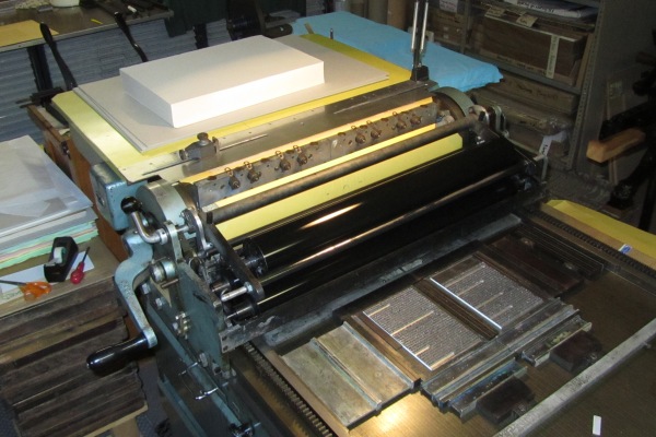
I check every tenth sheet against the standard dark and light sheets before touching up the ink: the tenth sheet should look like the light standard and I adjust the inking as necessary. I add a little bit to the top (vibrating) roller, varying the amount in different areas along its length according to the amount of type the roller is running over. How much one adds is of course purely down to experience. If I am worried, after adjusting the inking I also check the first sheet against the dark standard.
Copyright © Martyn Ould 2013.