 |
THE OLD SCHOOL PRESSMoments in the making of Oxford's Ornaments Click on the image to move on to the next. |
|
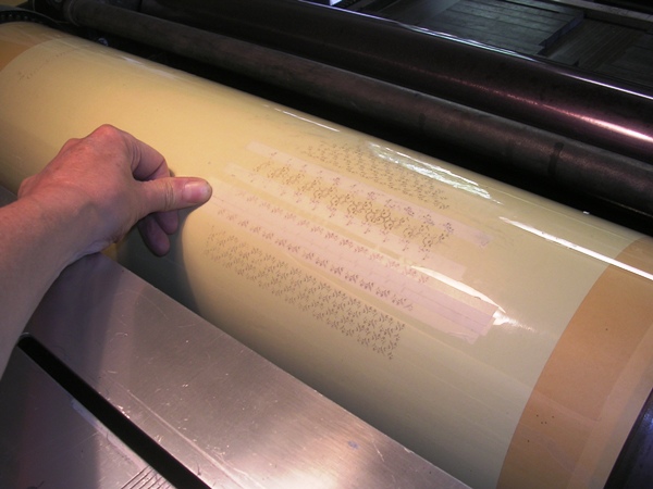
Harder than it looks One gets very used to the precision of Monotype. For instance, the type that Stan Lane set for me is all perfectly the same height and as such prints evenly. For a variety of reasons however, Oxford's ornaments never had the same consistency: some ornaments are a tad shorter than they should be which means they print light, and others have a printing surface that is not level so that some of the ornament prints dark and some light. It is pretty much impossible to correct all this in the printing, especially when there are hundreds of the little beasts all close together. However, I can correct some of the grosser inaccuracies. Here you can see that I have printed onto the Mylar tympan sheet on the cylinder and I have stuck very thin tape onto the Mylar where the type is lower than it should be to correct the height-to-paper. |
 |
|
Copyright © Martyn Ould 2007. | |